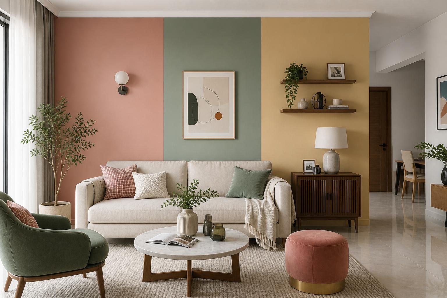
Choosing the right paint colour is one of the most impactful — and most stressful — decisions in home design. A colour that looks beautiful on a small swatch can feel overwhelming on four full walls. Indian homes, with their typically warm natural light and moderate room sizes, respond uniquely to paint. This room-by-room guide takes the guesswork out of the process.
1. The Most Searched Colours of 2026
According to paint brand data and interior design search trends, these are the colours dominating Indian homes this year:
2. Living Room: Go Bold or Go Warm
The living room is where you entertain guests and spend family time — it should feel welcoming but also reflect your personality. Two approaches work brilliantly in Indian living rooms:
- The Warm Neutral Base: Walls in warm white (not cool white — that looks clinical in Indian light), greige, or sand. Layer warmth through furniture, textiles, and a statement wall.
- The Earthy Statement: One wall in terracotta, warm clay, or deep olive with the remaining walls in an off-white. This grounds the room and creates immediate visual interest without overwhelming.
Avoid cool greys and stark whites — Indian sunlight has a warm orange undertone that makes cool colours look washed out in the day and cold at night.
"Always test your chosen colour with a large 30×30 cm sample on your actual wall, and check it at three different times of day — morning, noon, and evening. Paint transforms dramatically under different light."
3. Bedroom: Calm, Serene & Sleep-Friendly
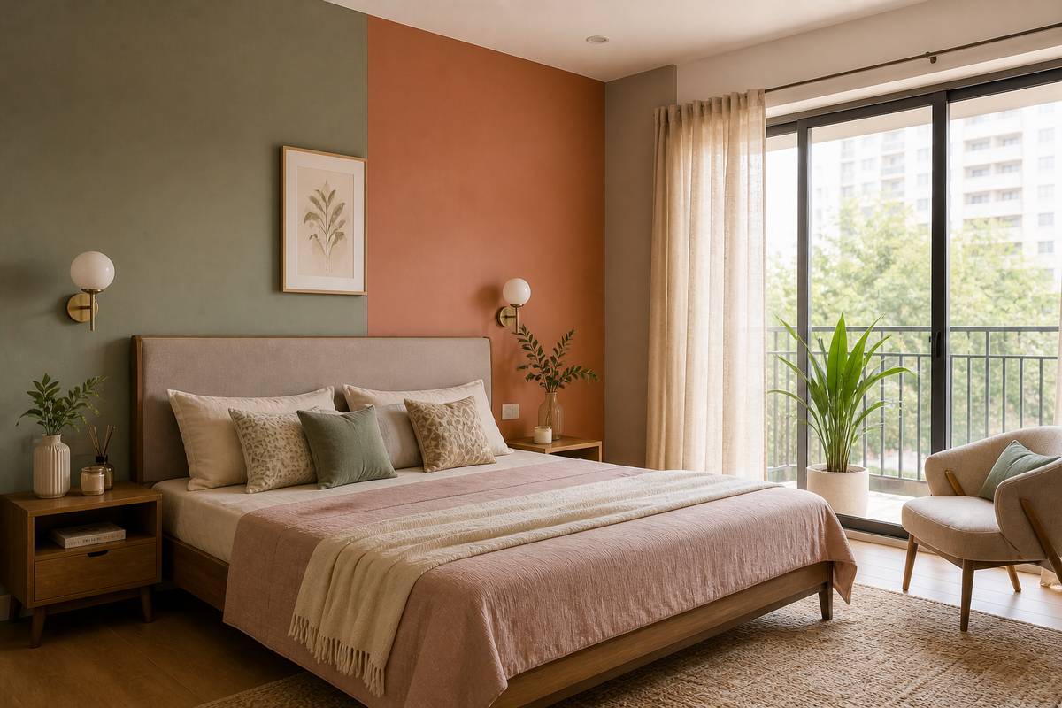
Bedrooms need colours that quiet the mind. Research in colour psychology supports soft, low-saturation tones for better sleep quality.
- Sage & Eucalyptus Greens: Deeply calming. Works with wood tones, white bedding, and rattan accents.
- Dusty Rose & Blush: Warm, intimate, and more sophisticated than pink. Great for master bedrooms with warm lighting.
- Warm Lavender: Trending for its relaxing, slightly luxurious feel. Works well with charcoal or brass accents.
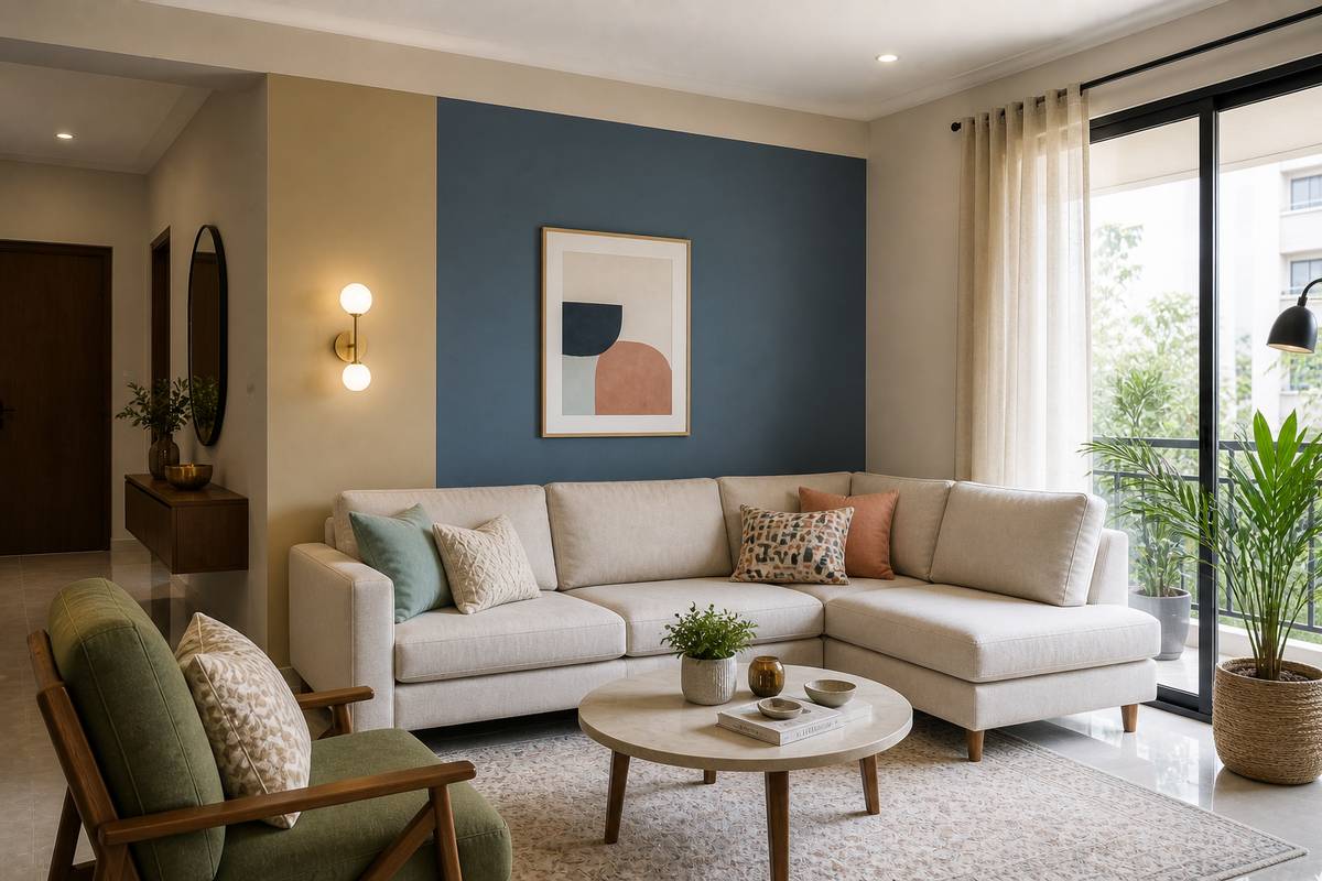
- Deep Navy (Accent Wall Only): Behind the headboard only — creates a dramatic cocoon effect without darkening the whole room.
4. Kitchen & Dining: Fresh and Functional
Kitchens benefit from colours that feel clean, fresh, and stimulating (you want to enjoy cooking, after all). Popular choices:
- Soft White or Off-White: Classic. Reflects light, makes the kitchen feel airy. Choose a warm white (with yellow undertone) rather than a blue-white.
- Pale Yellow or Saffron Accent: Cheerful, energising, and culturally resonant. Works well as an accent behind open shelving.
- Mint / Pale Seafoam: Fresh and modern. Works beautifully with white tiles and brass fixtures.
5. Bathroom: Create a Spa Moment
Small bathrooms benefit enormously from the right colour. Avoid dark colours unless you have excellent artificial lighting and a large mirror.
- Crisp White + Grey Tiles: Timeless and always looks clean.
- Deep Teal or Forest Green: For bathrooms with good lighting — feels luxurious and spa-like.
- Warm Beige + Natural Stone: The most popular combination in premium Indian bathrooms right now.
6. Paint Finish Matters as Much as Colour
- Flat/Matte: Hides imperfections, looks luxurious, but difficult to clean. Use on ceilings and low-traffic walls.
- Eggshell: Slight sheen, slightly washable. The sweet spot for bedrooms and living rooms.
- Satin: More washable than eggshell. Great for kids' rooms, hallways, and kitchens.
- Semi-Gloss / Gloss: Easy to wipe clean. Use only on trim, doors, and cabinets.